Saturday, August 31, 2013

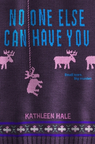
Cover of the Day: No One Else Can Have You

No One Else Can Have You

     This is one of the most unique covers I've ever seen! When I first saw this I had so many questions! And now I just want to read it more than ever. I love the way it looks like an old school sweater that you would be embarrassed to read in public. I also love how one of the reindeer (Moose?) is hung . It shows that the book will be a thriller and in my mind its telling me to expect some crazy things to happen. And with the title, it makes it even more creepy! I can't wait to read this! 

Wednesday, August 21, 2013

Cover Of The Day: The Best of Us


The Best of Us by Sarah Pekkanen

I love the red sideline of this cover, and it definitely fits with the font of the title. But the thing i LOVE the most about this cover is the cover itself.I mean, look at the beach, the trees, the whole relaxing moment,it's AMAZING-looking and it captures you right now! It's that exciting. It looks like the perfect summer read, i hope it is!

What do you think?

- Soma

Saturday, August 17, 2013

Cover of the Day: Side Effects May Vary


15728577-side-effects-may-vary.jpg
Side Effects May Vary by Julie Murphy


     What I love most about this cover is the font and the different colors of the title against the black background. It makes it look like a super fun book, but reading the synopsis you see that its actually about something very serious. I also love the little pictures that are featured on and next to the words. It gives a clue as to what some of the things she wants to do. I'm curious as to how those things (and all the others) end up! Lastly, the tagline?! Tell me that doesn't sound intriguing!!!! 

So what do you think? 
Love it, like it, or hate it?
-Nikki H

Saturday, August 10, 2013

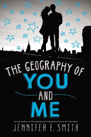
Cover of the Day: The Geography of You and Me by Jennifer E. Smith

The Geography of You and Me

     I love that this cover is like her other ones with the black, white, and gray theme and then having another color to make it pop even more. Especially the blue stars! I love that this one has more black and the blue is like electric which is really pretty together. And of course, the couple canoodling there on the sky line is nice to look at too. As far as the font, I love everything about it. How big it is, the colors, and that it matches the other books by her. Here's to another pretty book to add to my shelf! 

Wednesday, July 31, 2013

Cover of The Day: Left Drowning


Left Drowning by Jessica Park

This cover is beautiful in every way. I love the blend of the colors. It's always a pleasure to notice the cover artist's talented work. The water ripples give a calming vibe to the cover and model girl facing away from the camera also gives off a mysterious and a bit creepy vibe. The title font is awesome, i love these kinds of fonts. the author's name has been given its fair share. I absolutely adore this cover

What are your thoughts?

- Soma

Saturday, July 27, 2013

Cover of the Day: A Really Awesome Mess

A Really Awesome Mess
A Really Awesome Mess by Trish Cook and Brendan Halpin

     I'm not exactly sure what this has to do with the story because I haven't read it, but I still love this cover. It sounds like it'll be a very serious story, but this is still a really fun cover. I wanted to read it before I saw the synopsis just because I wanted to know who was eating their lunch off these things lol I also love the colors. The yellow is super bright and is asking for attention. The white and silver are stand out clean against everything else. It also took me back to my childhood, I used these all the time in school. I also love the font of the title and author's names. Just because it looks kind of bad... But that's the point right? The title is "A Really Awesome Mess".....
So what do you think? 
Love it, like it, or hate it?

-Nikki H

Thursday, July 25, 2013

Cover of The Day: Overpowered


Overpowered by Mark H. Kruger

Well, I love the color, green. It's always so lively and alive. This cover had the same impact on me. I loved the strange hues of colors and they match together so well. The shadow of the girl also gives off a mysterious but lovely vibe. What I didn't like though is the title's size. It's too small. It's like, you have to strain to actually read the name of the book or the author. Too, small. Way too small. Which is a huge problem, i think

What are your thoughts?

-- Soma